
Valckenborgh
At Valckenborgh, everything revolves around genuine attention. Living, care and community come together in a place that feels like home. We brought the soul of this organisation to life — through words and visuals that reflect its heartfelt mission.

01 / 04
Challenge
The introduction of a new home care service called for clarity. How do ‘living’, ‘day care’ and ‘home care’ relate to each other? One story, or three separate brands? As our conversations deepened, it became clear that the internal story no longer matched the external identity. Together with Valckenborgh, we took a step back to reconnect with the core.

02 / 04
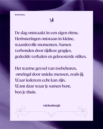
Verbal Identity
What truly defines Valckenborgh? In a series of in-depth conversations, we reached the heart of it: residents don’t just feel at home — they are at home. Everyone is free to be themselves — residents and colleagues alike. That sense of equality allows for truly personal attention.
From this insight, we developed a tone of voice that is warm, authentic and characterful. The brand story brings it to life — internally as a compass for 30+ team members, and externally as a powerful expression of who Valckenborgh is.
03 / 04
Visual Identity
To capture Valckenborgh’s authenticity, we started with a hand-drawn animation as the basis for the brandmark. The colour palette emerged from the brand’s personality—soulful, warm and distinctive. The visual identity now lives in every expression, from signage to website to print. It feels like coming home, while standing strong as a unified brand.


04 / 04
A new film
No script, no frills — just the real story of Valckenborgh. Told by the people themselves, captured exactly as it feels. The film brings to life an atmosphere that words alone can’t always express. An honest introduction to a place where care means genuine, wholehearted attention.

Ontdek ook andere cases

What we do
Our process is built on four pillars
01—Strategy
02—Identity
03—Implementation
04—Activation